Ushering in a railway renaissance
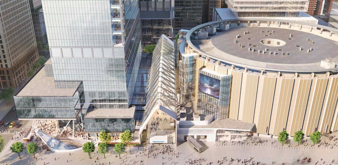
For decades, Penn Station has epitomized American neglect for railways. 600,000 passengers scuttle through a catacomb of platforms, corridors, and stairs—entirely unbefitting of America’s biggest metro area.
In 2021, New York opened a $1.6B expansion to the station: Moynihan Train Hall. With its spacious, sun-lit concourse, Moynihan seeks to redeem the passenger experience and recapture the magic of train travel.
From 2018-2021, our team developed a comprehensive wayfinding strategy and standards, signage, information graphics, and maps.
Guests need a cohesive experience; Penn Station provided three poor, disjointed ones instead
Thanks to disjointed operations in which Amtrak, Long Island Rail Road, and NJ Transit each reside in their own separate fief, the station felt like three redundant, barely-connected spaces–each with markedly different architecture, services, information, and quality.
At Moynihan, our defining goal was to create one consistent, unified experience centered around the guest journey.
In pursuit of this, we developed:
a cascading information strategy–
placing relevant information only at the appropriate momentclear, consistent nomenclature across all carriers, locations, and touchpoints
uniform signage, pictograms, and color coding throughout
-
Working collaboratively with Amtrak and LIRR, we conceived a unified approach to passenger information displays (PIDs). We leveraged the wayfinding system typeface, pictograms, and other vernacular—while aligning route colors and other details with each stakeholder’s standards.
Amtrak and LIRR PIDs are always paired together, so passengers never need to search for their carrier’s information.

-
The signage family includes suspended directional panels, facility identifications, transom lettering, and surface graphics.
We curated sign types and sizes to respond to various user situations, reading distances, and surrounding contexts.
-
The typeface DIN was originally designed for use on railways. Set at an appropriate cap height within a comfortable layout, text is naturally readable from afar.
-
Color coding categorizes destinations, allowing users to quickly scan for information.
Amenities appear on anthracite, while trains and street exits are highlighted with yellow and blue, respectively.
-
Adapting universal AIGA pictograms for today’s visual trends, our pictogram set stylishly clarifies messaging for local and foreign guests alike.
-
Internal illumination ensures that signage ‘pops’ within the train hall’s visually rich and dynamic environment.
Architecture leads the way
We leveraged architecture to create spaces that are not only conducive to navigation, but that also lead the way, naturally.
Lighting, ramped floors, and soft echoes draw guests intuitively into the main atrium. When they arrive there, it’s spacious, with clear views of all the tracks and key amenities. Merely gate boards, a landmark clock, and perimeter lettering punctuate the space.
De-complicating the station complex
Our three-dimensional map helps passengers understand the Farley building’s uniquely-shaped, city-block-sized floors.
A specially-designed station diagram overviews the entire Moynihan–Penn Station complex. This is a crucial tool that clarifies connections to the subterranean concourses, neighboring buildings and streets, onward transit, and even the front/back of trains.
In addition to static locations, these maps were integrated into digital information kiosks. Our team collaborated directly with the developer to optimize wireframes, align visual assets, and ensure an accessible layout and design.

A brighter future for rail
As the Moynihan–Penn Station complex continues to redevelop, Mijksenaar and other wayfinding consultants are working to integrate our wayfinding projects. The recently completed 33rd St Concourse, for example, adopted the Moynihan system.
More broadly, as the U.S. rekindles its railways, we hope Moynihan Train Hall can inspire the passenger experience of tomorrow.


